Sunday, September 28, 2014

Fall Scrap-a-stack

Happy weekend, Everyone!  Next weekend is my fall scrap-a-stack.  I have 13 people signed up -- Yikes! that's a lot of prep, but I'm not complaining. :)  Feeling happy that so many of my peeps are excited about it.  One of my goals for this class, is to use up retired papers I have acquired, so all of these layouts used retired products.  For the $25 class fee, each person gets to make (5) 2 page, 12x12 layouts, so each person goes home with 10 pages to add to their scrap books.  Pretty sweet, huh!  I tried really hard this year to make the layouts simpler, so the class wouldn't take so long and the prep for me wouldn't be so laborious as it was last year.  Hopefully I succeeded. :)

Here is the lineup:


I saw a version of this layout at Convention this year, so I have no idea who to give credit to for this idea.  It was so simple, yet so elegant!  It is the Blended Bloom stamp used as a background, as well as the bitty butterfly punch.  Simple, yet effective!  These darling photos are of my kiddos and dad picking raspberries at my parents' home in the Yukon, Canada.  LOVE the pic of Sabina with her bucket and a few berries and that darling little look!  Pure cuteness!


 Here is another layout inspired by one I saw at Convention.  I changed it up to be my own, but none-the-less -- inspired by someone else's design.  These are pics of a recent hike to the incredible Avalanche Lake in Glacier National Park.  That amazing title is stamped with the new SU Larger Thank Life alphabet set, which my friend, Leah, generously let me borrow as I don't own this one yet.


Another layout inspired by an idea I saw on Pinterest.  I changed it up once again, but the strips of paper was someone else's idea.  The title uses the Scalloped tag topper punch, and I stamped the "thanks" word (from the Holiday catalog -- Seasonally Scattered stamp set) first in (retired) More Mustard ink, and then used a sponge dauber to add some Cajun Craze in just over the word and then stamped it.  Those little wood elements are also from the holiday catalog.  LOVE them.  The word "GIVE" is cut out using the "Little Letters" thinlets.  Of course, some texture embossed fall leaves adds a great touch as well, using the Autumn Accents die.


This layout will make a nice dent in my extensive Designer Paper stash!  Yippee skippee!  Inspired by a layout I saw on Pinterest.  The title here also uses the Seasonally Scattered stamp set.  Simple, cheerful, and summery!


I had almost a full pack of the Natural Composition papers left, so I wanted to make a layout using that designer paper.  I also love making the film strip look using the spiral border punch -- which has made a recent comeback in this year's catalog.  I love how the little photos look on the "film strip".  Some super cute pics I took while visiting a favorite lake in the Yukon, Canada, with my parents this past August, were perfect for this layout.  The journaling element is a little punched piece made to look like a page from a notebook.  Kinda fun.  I used the new (this year) Bordering Blooms stamp set to make the stamped vine outline.  So simple, yet lovely!  A very great and versatile stamp set, I think. I also used the ticket punch and the matching "That's the Ticket" stamp set to add some tickets to go with my theme.  I like how this layout turned out.  Monocromatic, with a little pop of color -- the retired Raspberry Ripple.  The title uses a SU set -- Feel Goods.  The black scalloped strip is punched with a retired SU punch.  It tends to be finicky sometimes, and hard to punch, which I am sure is why it got discontinued, but I still love this punch very much!

That's it for today!  Have an amazing rest of your weekend!!!

Just as an FYI, there is a new promotion happening Oct 1st - 6th where a bunch of the essential supplies are going to be 15% off -- boring, but necessary stuff, like envelopes and adhesive and card stock as well as a few stamps will be on sale.  Details to follow when I find out more!  Yeah!!!

Saturday, September 20, 2014

A Little Kindness goes a long way! -- Kinda Eclectic stamp set

Happy Saturday, Everyone!

Here is a card that is a remake of a make-n-take we created at the SU Convention this year.  We received the stamp set, "Kinda Eclectic" for one of our free sets, and it is really growing on me!  The leaves and the unique sun and the stamp with all the dots really make a project pop.  We made this card at my club this past weekend, and everyone really loved it.


The card base is Crumb Cake, and the top panel is Whisper White.  The first step, was to use the Honeycomb embossing folder to "stamp" the hexagon pattern onto the white panel.  Simply use your ink pad direct-to-folder to ink of the folder (I used the back part of the folder rather than the front side -- i.e. don't use the side that says SU on the front).  Next, lay your white panel on top and gently and randomly smooth it out -- it's ok if the whole panel is NOT inked -- it looks better if your background is slightly random with some sections not all the way inked.  Next, I stamped the sun in the center with a new In Color ink -- Hello Honey, then the leaves: stamp in another new In Color, Mossy Meadow -- I stamped the same inked stamp twice before re-inking -- thus creating one darker set of leaves, and one light colored set.  Now, apply some generous adhesive in a little circle directly in the center and add your loops of linen thread.  Next, a half inch strip of designer paper with the ends snipped at an angle -- here I used a piece from the Park Lane DSP pack.  The sentiment from the same stamp set -- stamped on a 1" wide strip of Crumb Cake card stock.  I overstamped with the little dots stamp from the same set, using Crumb Cake ink which I stamped off onto my scratch paper first to make the dots lighter.  Finally, I flagged the corners and curled the ends with my bone folder and attached to my card using dimensionals to hold the "mountain curve up" and glue dots to keep the valley part down.  The little flowers are punched from Hello Honey card stock using the new Itty Bitty Accents punch pack.  The butterflies are stamped in two more new In Colors -- Blackberry Bliss and Tangelo Twist and punched out with the Elegant Butterfly and Bitty Butterfly punches.  Kind of a lot of steps to this card, but not difficult....

Be sure to check out this weeks weekly deals!  The Label Thinlets die is on sale for 25% off!  LOVE that little die! -- check out this post to see projects I've made with the Circle card Flip-it-die: Festive Flurries Meets Flip-it-die  Also, a few new treasures were added to the Clearance Rack several days ago as well.  Yippeee Skippeee!

Saturday, September 6, 2014

Ooh La La! Blended Bloom

Happy Saturday, Everyone!

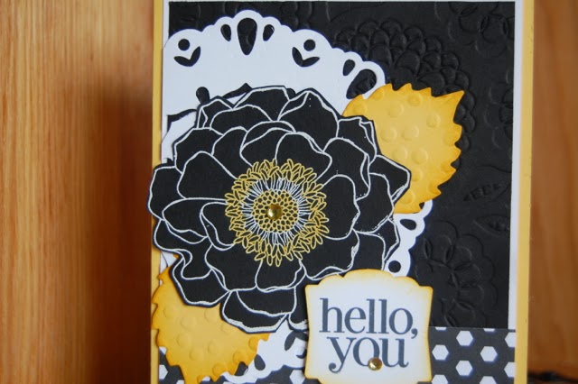
Today's card is one I made for a Wow card swap I participated in at Convention this year.  I have to say that I LOVE how this card turned out.  The color combo of Black, White, and Daffodil Delight is so striking -- hard to go wrong...


A super cool technique that I incorporated into this card is using the Blendabilities markers to color on top of a white embossed image.  So, I first embossed Blended Bloom using Versamark and white embossing powder on black card stock.  I then simply colored in the center of the bloom with my Dafodill Delight Blendabilities markers.  Because the card stock is black, you can't see the "out of the line scribbles" with the marker.  Pretty cool, right????  Really makes this flower pop.  I also colored the rhinestone with the blendabilities.

Of course, then I fussy cut the flower out.  Yep!  All 20 of them!  The leaf is cut from Daffodil Delight card stock from the Autumn accents die.  I simply embossed the leaves with the dots embossing folder and sponged the edges with Crushed Curry ink.  That gorgeous white doily thingy is the new Darling Doily thin lit die.  I don't know if any of you tried the doily die from the last catalog, but it was a bit HARD to use -- so much so that I stopped demoing it.  THIS one, however, is fabulous and comes out easily and beautifully every time.  SO happy as I love this look.  One trick, put waxed paper between your die and the card stock before you cut and your doily will pop out super easily.

The black panel is embossed with the Lovely Lace embossing folder.  I used the Artisan Label punch and a sentiment from the Regarding Dahlias stamp set, using the new Tuxedo Memento Black ink pad.  THE new awesome black!  In my opinion, toss your old SU Basic Black in the... uh ... trash... and get this new awesome one.  No more smearing, washes off your stamp easily, and gives you a crisp perfect image every time!  AND, it doesn't stamp purple as some of the old black used to do sometimes.  

That cute strip of black and white DSP is from the Black to Black pack.  I admit I wasn't sure how much I loved this paper, but in real life it is so much prettier than in the catalog -- and if you don't like one side of it, the other side is generally much better.  Just an FYI.

Ok! off to enjoy this gorgeous day!  Think I'm going to wash my dirty windows and not sure what else...  According to four year old Sabina, there is a lot of "Mama time" lined up for the day -- coloring together, Kinetic sand creations, and Barbies! :)  My little sweetheart is growing up... but I'm glad she still likes to be with me.  AND, she has the crafty bug as big as her Mama's which makes my heart happy.  She has her own desk and faithfully colors and paints every single day -- sometimes several times a day.  LOVE it!

If you haven't seen the new Holiday catalog yet, it is really great this year!  I think it is one of the very best yet.  So excited about it!

Until I stamp again!...