Wednesday, May 18, 2016

Drapery Fold Technique

Happy Wednesday, Everyone!

I recently saw this "drapery fold" technique idea, and just had to share it with my peeps at the last stampers' club.  I have seen several different fold dimensions, but I really liked this tutorial done by Lyssa Zwolanek.  It is really easy to follow, and simple dimensions as well.  You'll start with a strip of designer series paper -- 11 1/4 x 4".  Score at 3, 4, 6, 7, 9, and 10".  Cut a "wedge" off the bottom -- angling up from the 3" score line to the opposite short edge, leaving about 1 1/2" of that 4" side in tact.  Accordian fold your DSP and this is what you get!  So easy, and yet so awesome!  Lyssa did a great job with her photo tutorial, so be sure to check that out for step by step instructions.

For this card, we used Sahara Sand as the card base, and strips of paper from the Timeless Elegance pack, which has sold out already, unfortunately.  However, you could do this technique with any DSP that has a coordinating pattern on the opposite side.

Also featured on this card, are the Botanicals dies as well as the Blossom Bunch punch for the flowers.  The sentiment and that lovely little frame, is from the Rose Wonder stamp set and coordinating die set.  I really love the sentiments in that stamp set.  Simple, elegant, and coordinating messages for the insides of your cards.  We used Soft Suede ink to sponge around the flowers, to enhance that vintage look.  And, last but not least, some clear Wink of Stella adds that gorgeous shimmer to the flowers!  LOVE that stuff!  Easy to apply, dries quickly, and zero mess!

Only two weeks until the NEW Catalog will be here!  Yeah!  Grab your last retiring must haves before they are gone!


Saturday, May 7, 2016

World of Dreams Congrats card

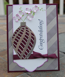
The stamp set, World of Dreams, is also retiring this year.  It is another favorite of mine -- the silhouette images are really perfect for all your "scene" types of cards -- where you want a silhouette in the foreground, and mountains, or whatever, in the background -- like in this post.  I used this same set to make a Mother's Day card -- with little pearls in the nest for the eggs. :)  Sweet!  You can see that card in this post -- just scroll on down a ways, as it's towards the bottom of that post.

Another retiring product that I'm super sad to see retire, is the Itty Bitty Accents punch pack.  This little flower is one I use ALL the time -- and it pairs perfectly with the orchid stamp from World of Dreams.  For the "vase" on this card, I used the intricate ornament dies and layered two of them together and cut off the tip to make it flat like the bottom of the vase.  Clever use for your ornament dies, that isn't Christmas. The silver fancy foil vellum is another beautiful product that's retiring.  It comes in silver and gold, and I discovered I had an entire pack of the silver that that I hadn't used at all, so decided it would be perfect for this graduation card.  Hint: when you're gluing down vellum, you will see the glue through it, so if using this patterned vellum, put your glue where the silver stripes are, as then it won't show when you attach it to your card.

I did the "vase" a couple different ways -- first I made the base vase Blackberry Bliss with silver foil layered on top, and second I made the base silver foil, and layered black on top. Not really sure which one I like better...  What do you think?


"By the Tide's" final debut

Happy Saturday!  Before the day gets crazy, I might as well post to my neglected blog while I enjoy my coffee!...

This card is one we are doing for my stampers' techniques club this month.  This stamp set, "By the Tide" is on the retiring list. :(  So sad, I love this set, and won't be getting rid of it, as it's a perfect realistic "ocean" type of set with the coral and fish and adorable sea horses.  I've used it for many projects -- from scrap pages to cards.

The hostess this month, wanted to use this set for a Father's Day card, so we are doing the "faux tile" technique -- read all about how to do these techniques in these posts.

Card stock colors I've used here are: Island Indigo, Soft Suede, and Whisper White.  That cute banner for the sentiment, comes from the "Number of Years" bundle -- a very useful set of dies and stamps!  The card base, is stamped in Island Indigo ink with the nautical looking stamp from another retiring set -- Open Sea.  It's a great stamp for adding that nautical touch to your project.  Ink colors used: Island Indigo, Cameo Coral, Memento Black, Soft Suede.  I strategically sponged my card to give the effect that sunlight is shining through the water to the ocean floor -- kind of highlighting the sentiment.  It's hard to photograph, but the fish panel is shiny -- just like tile -- since it's embossed with clear embossing powder.  Fun look!