This first one features a new product from the Holiday catalog -- the Start of Light bundle. I LOVE that little "Milky Way" type flourish that comes in the stamp set, and the intricate die cut stars are beautiful!!! One thing I learned recently, is that if you cut your glitter paper glitter side down with intricate dies, it works so much better. These intricate stars are just such a die that works better this way. To make that scalloped border, we used the Best Badge punch -- you just insert your DSP strip into the top of the punch and take "bites" out of the edge with the top cutting edge of this punch. Easy peasy, and gives you another use for this punch. We embossed the flourish on opposite corners using Versamark and White embossing powder. Helps give it a great "pop"
This next layout, is a CASE from one that Lyssa made on Song of my Heart Stampers. She is an amazing scrap booker (and card maker) and has so many tips to share regarding how to create a balanced looking page. I just loved how easy this layout was, yet eye catching. I really wanted to use my little acorn punch, as I hadn't featured it yet in a class, and it is so cute -- just makes me smile every time I see it! I had these cute "first fish" photos, that also were taken in October, so I went with a fall look and folks could substitute in a title that worked for their photos.
Here is another layout inspired by Lyssa. I had a ton of this Typeset DSP, and thought everyone would enjoy a vintage, black and white layout. Since the paper is black and Vanilla, I used a Vanilla matt for the left hand page, with 11" strips layered on. We used Soft Suede ink sponged over the whole page to soften the starkness of this paper, and help it all blend a little.
This next layout, BEACH Day, is a nice bright layout perfect for those fun summer pictures we all seem to have a lot of. I had a lot of this Orange DSP, so this was the perfect page to use it up on. The sail boat, kite, sun, and waves are all from the Swirly Bird bundle. This is such a unique set, that I thought was down right unusual when I first saw it, but now that I have it, I have found SO many uses for it. It makes the perfect sun (OR pumpkin, flower, wreath, you name it!). The title features the new big alphabet set -- Letters For You.
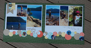
This "everyday adventure" layout was also inspired by Lyssa. These kits varied a lot based on what DSP papers I had on hand, so each person's layout was different than their neighbor's. Kind of fun. This is basically just a bunch of punched circles used to make an interesting border. The die cut words are actually from a Tim Holtz set I have.


